Building the brand identity of BUNBELOVED, a burger brand
BUNBELOVED enters the burger market with a clear promise: fast food at a premium level, with a creative touch. This work presents the identity designed for it, from the idea, values and tone of voice to the wordmark and BBL monogram, the colour and the type, and then its storefront and packaging applications.
 Brand Identity
The idea
The brand presents itself as a premium burger made with care and passion, moving beyond the ordinary fast-food meal toward one the guest returns to because they love it. That is the logic of the name: a blend of “bun” and “beloved”, carrying the promise in a single word.
Its mission is to redefine the burger experience by combining taste, quality and creativity in every bite, and its vision is to become the most loved burger brand. Four values hold it together: quality, innovation, passion, and a relationship with the local community.
Audience and personality
The brand addresses two groups: young adults and families who appreciate premium fast food with a creative edge, and food enthusiasts looking for new experiences in the city. The tone is elegant and charismatic, building trust, yet warm and close to the guest, leaning on storytelling that evokes nostalgia and joy, with short lines such as “Crafted with love and precision” and “Experience burgers reimagined.”
Name and logo
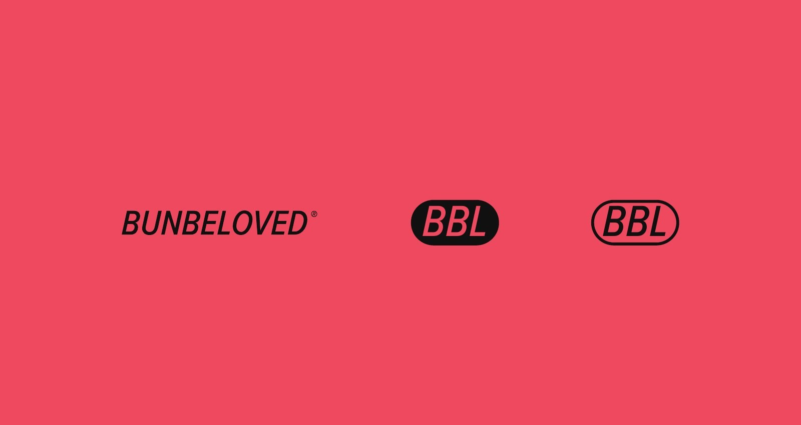
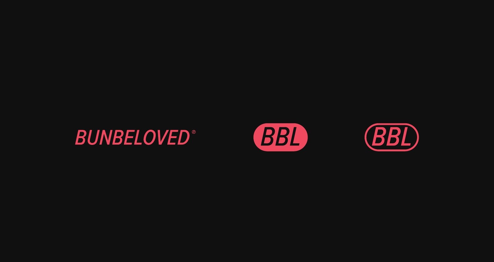
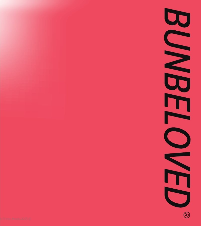
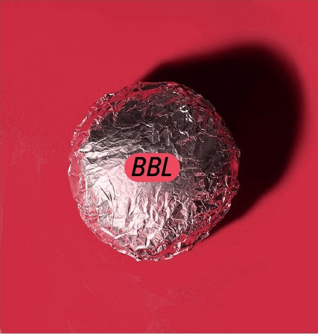
The logo is the word BUNBELOVED in wide, italic capitals that give the name motion and confidence. Beside it sits a three-letter monogram, BBL, inside an oval pill, in solid and outlined versions, so the mark works at small sizes, on stickers and on packaging where the full word does not fit.
Colour and type
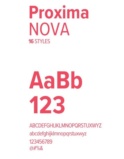
The primary colour is pink, #EF4960, chosen to carry more than one meaning: it evokes the freshness of fresh meat, and expresses the love and warmth at the core of the brand’s message. Black and white support it so the identity stays bold and clear. The typeface is the Proxima Nova family in its multiple weights, for its clarity and modern presence.
The menu
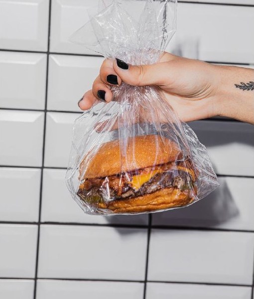
The menu is built on a few defined items, each with its own character: “Untouchable”, a beef burger covered in melted cheese and eaten with gloves; “Beloved”, the signature burger with a sauce in the brand’s brown-orange hue; “Chickin”, the chicken burger; plus fries seasoned with paprika and parmesan, and soft drinks and water.
Applications
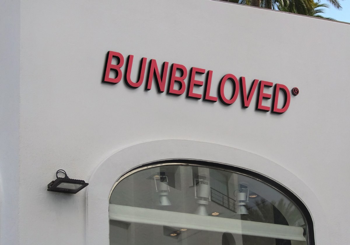
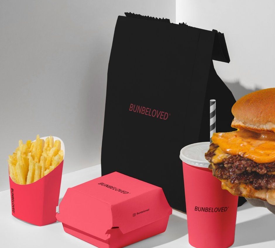
The identity was shown across the key touchpoints: the storefront sign in dimensional lettering, the order packaging including the burger box, drink cup, fries carton and black takeaway bag, and a foil wrap carrying the monogram. All are concept mock-ups showing how the identity stays simple and clear across elements.
What this means for your brand
In the burger market, competitors differ in detail less than their owners think, and real distinction lives in the idea told about the meal. That is why the work began with the message, values and personality, then translated them into one strong colour, a logo that works in two forms, and a tone that repeats on every pack and message. If you are launching a new food brand or redefining an existing one, the starting point is the concept: what you promise your guest, and with what personality.
The idea, concept and creative direction are by House of Idea, led by Mohammed Alhasoon. Identity execution and the presentation were produced by the ThirtyThree Media team. The storefront and packaging designs shown are concept mock-ups.
Launching a new food brand or rebuilding an existing one?Start with Concept Building: a document that settles the idea, name, personality and pricing before any design is commissioned.
Concept Building →