Building the visual and verbal identity of Come Early, a neighbourhood bakery
Most bakeries compete on speed and ready-made packaging. Come Early was built on the opposite idea: a calmer, lighter morning, with bread served at its best. The work covers the story, beliefs and values, the voice, the logo, colour and type, and their applications on bags and the team uniform.
 Identity · Voice
The idea
The brand starts from a simple observation: in many neighbourhoods the morning is rushed, wrapped in plastic and quickly forgotten. The bakery offers a different start, baking before sunrise so the guest arrives while the bread is still warm. The sun became the brand’s symbol, because it is the moment the bakery works toward.
The idea is distilled into a master tagline in Arabic and English, with supporting lines for service, product and positioning, so the brand speaks in one voice at every touchpoint.
The name
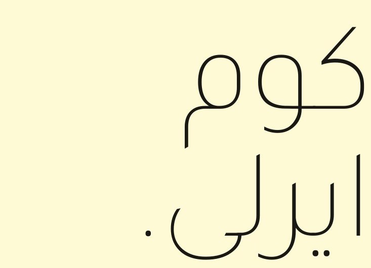
“Come Early” is an invitation rather than a command: to slow down, avoid the rush, and experience the bakery when the bread is at its peak and the day is still untouched. It is a short English name that is easy to say and carries the suggested time of visit in its meaning. The brand deck pairs it with the Arabic rendering “كوم ايرلي”.
Philosophy and personality
The brand philosophy is set out in eight beliefs, among them that mornings are worth waking up for, that patience is an ingredient, that lightness is not the absence of flavour, and that doing the same thing well every day is the work. Five values guide decisions: honest craft, slow on purpose, light over heavy, neighbourhood first, and morning as ritual.
The voice is that of a warm neighbour who happens to bake very good bread: calm, short and sensory, speaking of smell, weight, warmth and hands. It never shouts and never pushes a sale. Clear guardrails rule out exaggeration and inflated marketing vocabulary, with an example of acceptable copy that gives bread times instead of adjectives.
The logo
The logo is a hand-drawn wordmark in custom lettering rather than a typeface, always accompanied by a half-sun rising above the last line. It was designed in four versions for four surfaces: full colour on cream, black on yellow, cream with the sun on black, and cream on gold. Its use is bound by rules against rotating, stretching, recolouring, adding effects, or placing it on a busy background.


Colour and type
The palette is led by cream as the dominant colour, yellow as the colour of joy, and toasted gold for detail and small type, in a suggested 60 / 30 / 10 ratio, supported by black, bone and crust brown. Every colour is defined in RGB, CMYK and Pantone in the deck.
#FBDB3D
#B58A3C
#FEFAD6
#1A1815
#FFFEF0
#7A5826
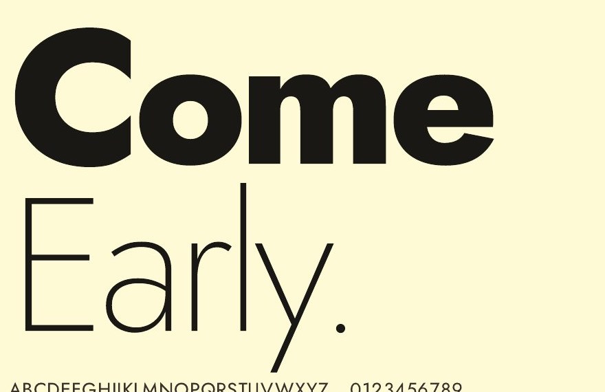
Two quiet geometric typefaces were paired: Jost for Latin and Tajawal for Arabic, each in a range of weights from extra light to bold, giving Arabic and English text a single rhythm.
Applications
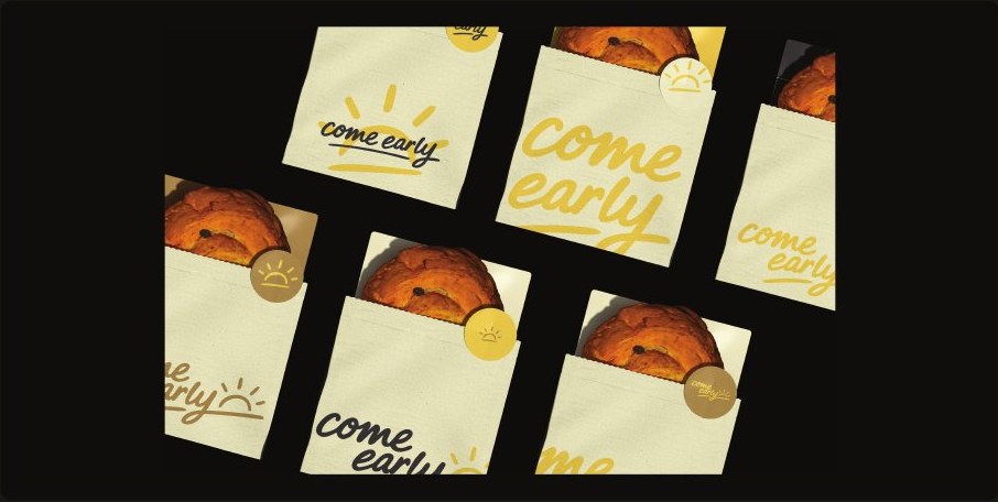
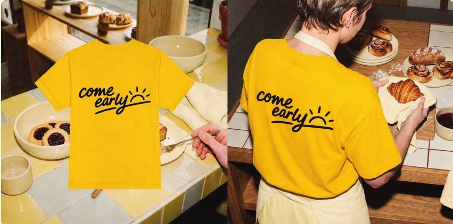
The identity was applied to the surfaces that guests and staff encounter. Packaging is natural kraft paper bags with no plastic, carrying the logo in cream or yellow, with the open edge sealed by a round gold sticker bearing the sun mark or the wordmark, in six alternating layouts. The team uniform is a yellow tee with a large black logo across the back, visible across the bakery floor and recognisable from the street, worn with a cream apron from the same palette.

What this means for your brand
A strong food brand starts with an idea that can be said in one sentence, then becomes a name, a logo, a voice and usage rules that make every bag, uniform and sign speak the same way. If you are opening a bakery, café or restaurant, start with the concept: what you promise your guest, in what voice you speak to them, and what you will never do.
The idea, creative direction, visual and verbal identity and brand deck for Come Early are by House of Idea, led by Mohammed Alhasoon, commissioned by the brand owner.

Opening a bakery, café or restaurant?Start with Concept Building: a document that settles the idea, name, voice and personality before any design is commissioned.
Concept Building →