Building the visual identity of Constructive Method, a trading, contracting and services company
Constructive Method works across three connected fields: trading, contracting and services. A business with that range needs an identity that shows discipline before anything else. The work delivered a brand platform, a visual identity and a brand book setting the rules of use, with application studies covering facades, field gear and print.
 Identity · Brand Book
The idea
The brand starts from the belief that a strong result begins with a shared understanding of the work. From that came the platform “The Clear Method”: clarity in agreement, discipline in execution, responsibility at handover. It brings the company’s three fields under one approach: define the scope, organise the work, and make the next step clear to everyone.
Because the method is what sets the company apart, it was built into five consecutive stages: understand, define, deliver, verify and hand over. In that frame the promise becomes credible, since it is tied to written scope, named responsibilities and timely updates.
Name and logo
The company name is Constructive Method in English, accompanied by its Arabic name in a single inseparable composition. The wordmark uses fine-detailed serif letters with real character, in two lines for the English name followed by the Arabic line. The composition has a clear space equal to a quarter of the English capital height, a minimum width, and six discipline rules that rule out stretching, restacking, shadows and gradients.
Personality and tone
The brand’s personality is calm, confident and precise, preferring clarity to exaggeration. This carries into a language guide: specific lines describing what is being done instead of generic claims, and a format for project updates that names the completed stage, the approval needed and its date. The rules rule out superlatives that cannot be backed by evidence.
Colour and type
The palette rests on quiet contrast in four colours: Ink Navy for emphasis, Warm White carrying most surfaces, Stone for calm structure, and Charcoal for long reading. They are used in set proportions so that light space is the base and navy is the anchor.

Two supporting typefaces complete it: Cormorant Garamond for editorial headlines and Manrope for body copy, tables and digital interfaces. They do not replace the distinct look of the wordmark. The system is finished with a six-column grid and rules for margins, type hierarchy and spacing rhythm.
Applications
Application studies show how the identity appears at every point of contact: the building sign, reception, entrance glass and a projecting sign; then the field with a company van, hard hat, high-visibility vest and site hoarding; then print and office items such as letterhead, envelopes, cards, a presentation folder and a notebook; and finally shipping labels, visitor badges and a tote bag. They are illustrative mockups of fictional settings, not fabrication files, and each carries a finish direction and a production note.
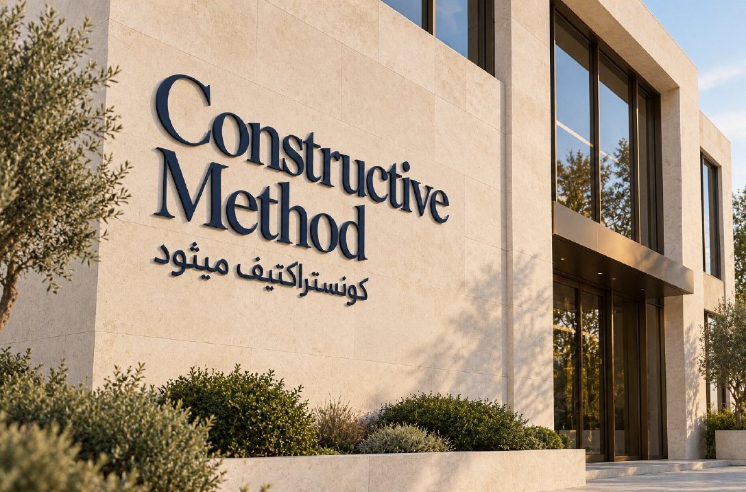
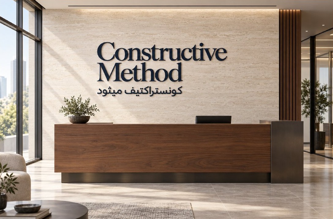
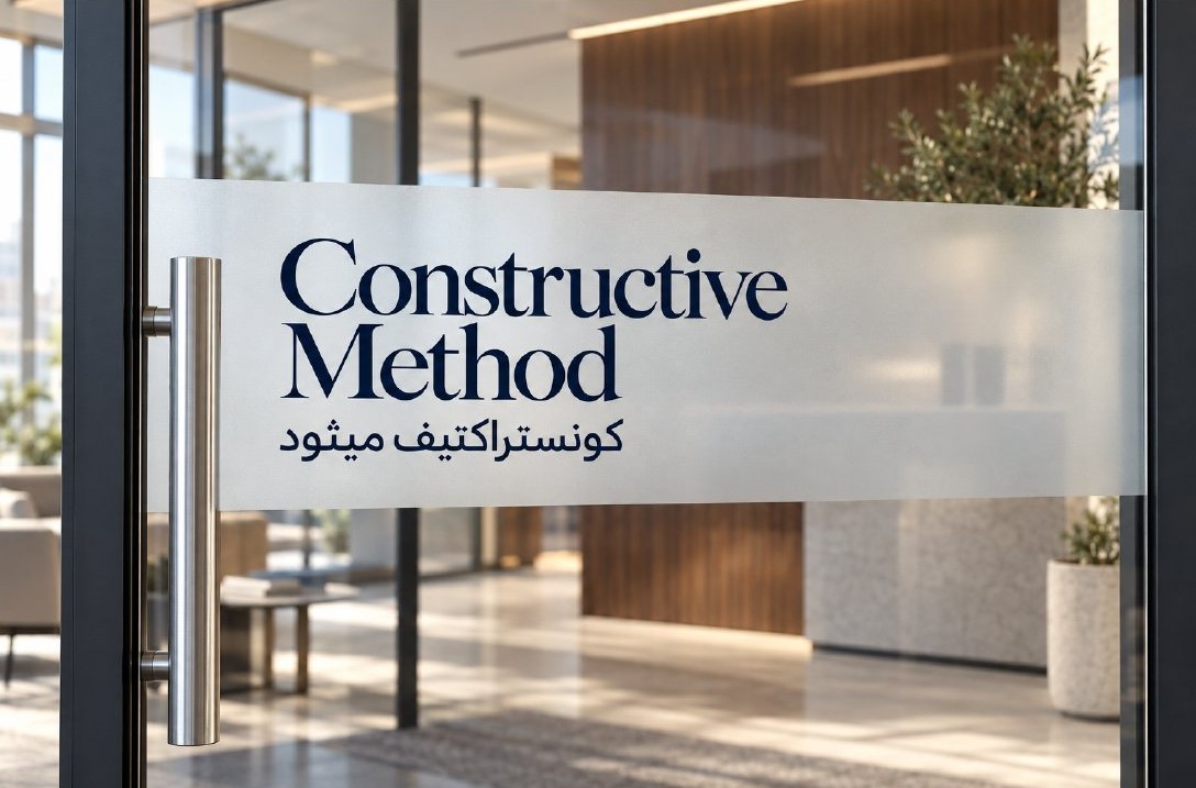
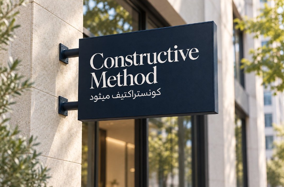
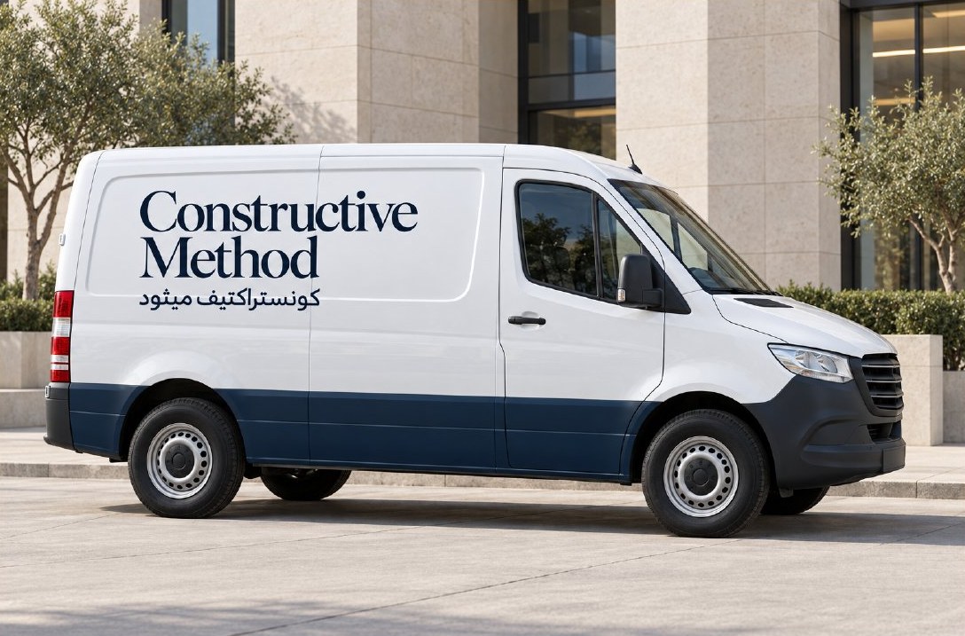
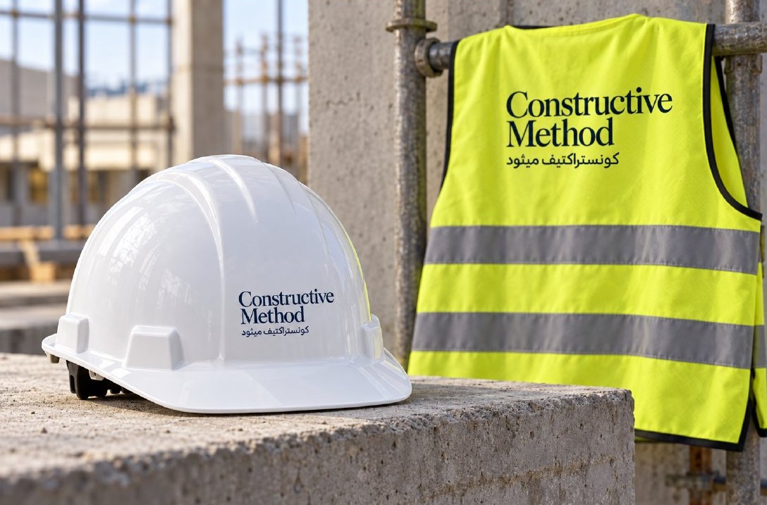
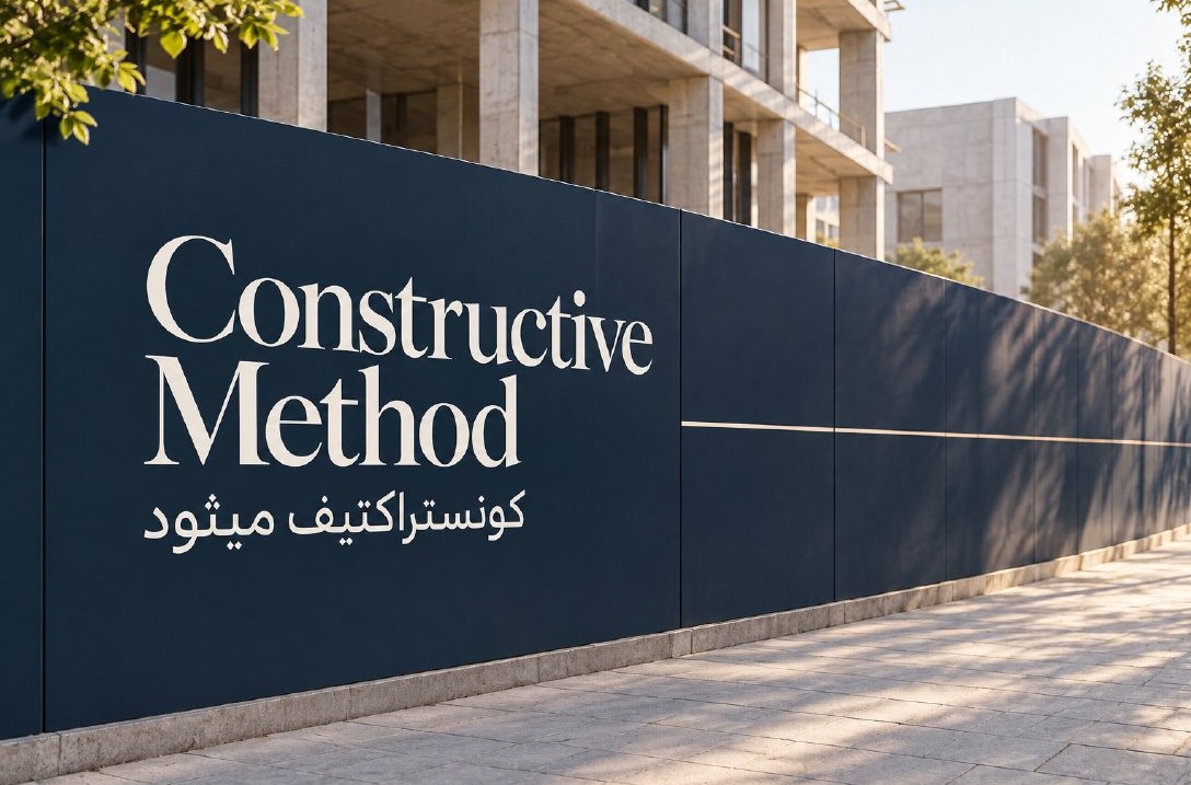
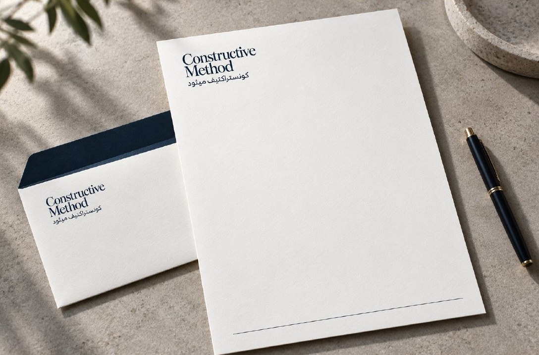
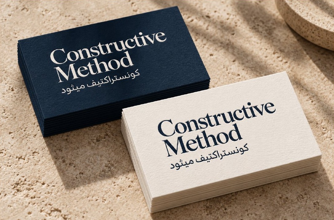
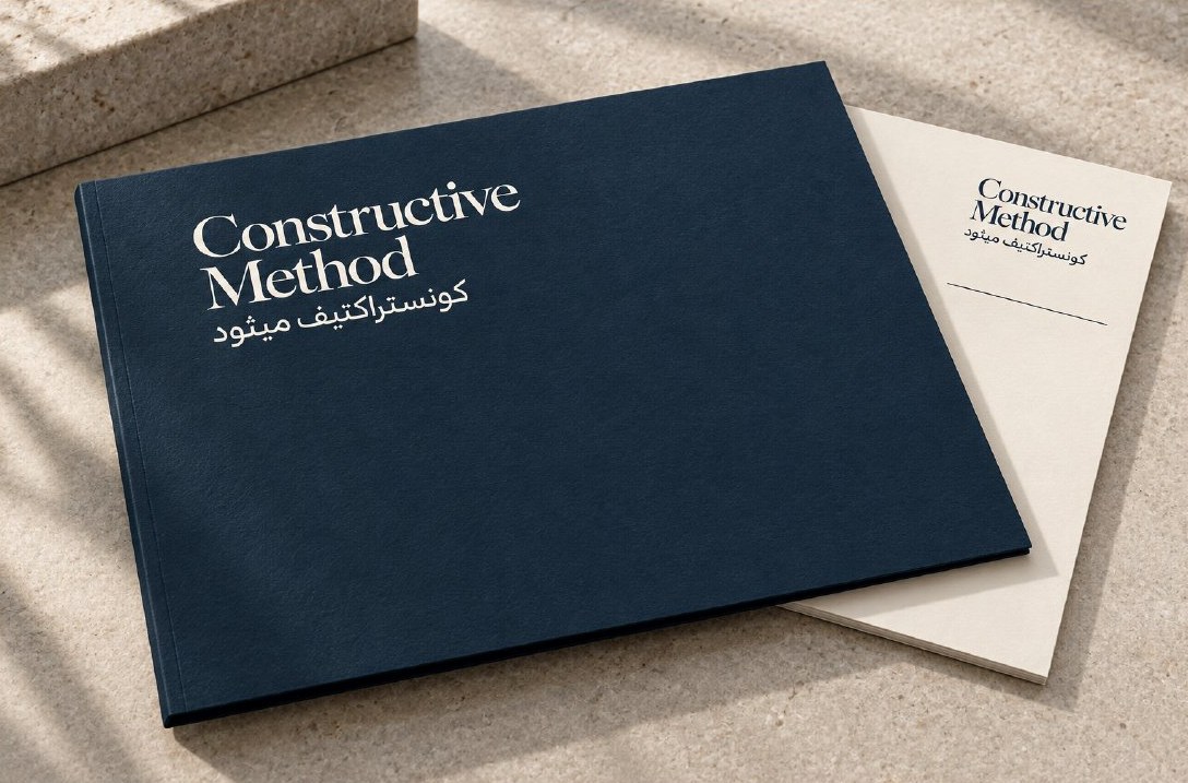
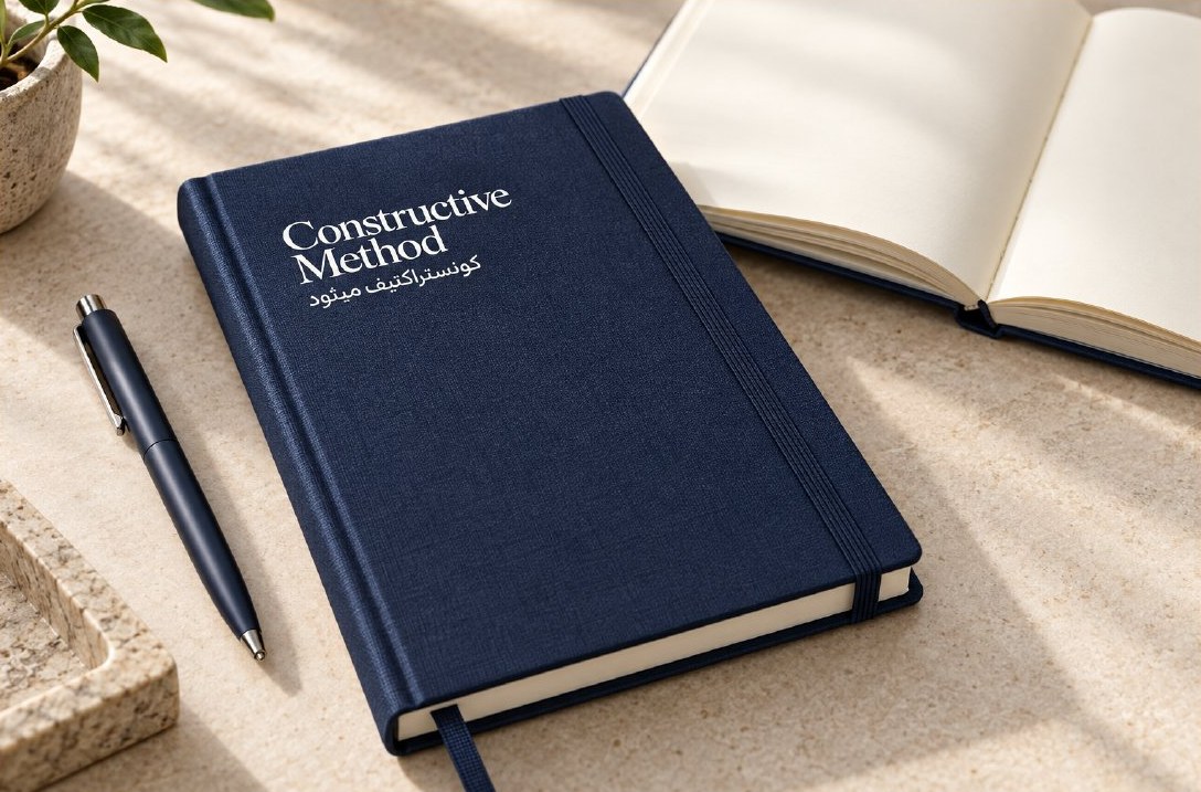
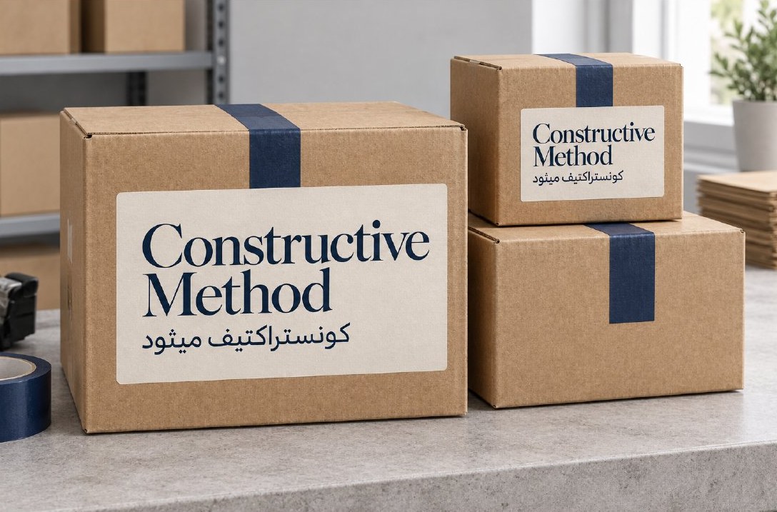
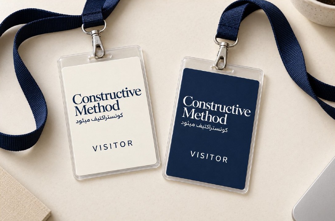
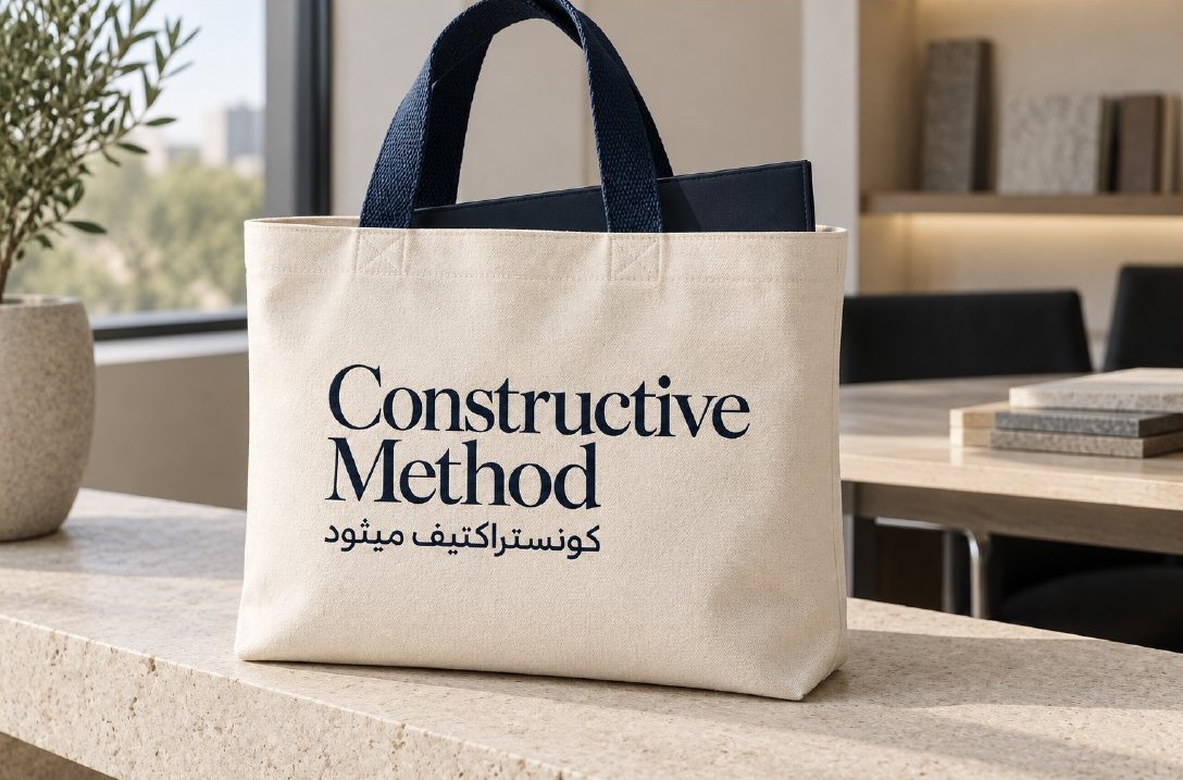
The book closes with a table of materials and finishes, where a sample is approved before any production order, and a three-step route to launch: prepare, prove, deploy.
What this means for your brand
Companies that work in more than one field need an identity that gathers their activities into a single story a client grasps at first sight; otherwise they read as several small companies. The starting point is the concept: what ties your services together, with what promise, and in what tone you speak. After that, the sign, the vehicle, the proposal and the card become extensions of one idea instead of separate decisions.
The idea and creative direction are by House of Idea, led by Mohammed Alhasoon, with visual execution and the brand book produced by the ThirtyThree Media team. The application mockups on this page are illustrative, set in fictional places, and the platform and vision described are strategic proposals for the brand.
Running a company that works in more than one field?Start with Concept Building: a document that settles the idea, name, personality and promise before any design is commissioned.
Concept Building →